Truly Brand
Refresh

I love designing, so I gave myself a design project - to rebrand Truly Hard Seltzer. While they were one of the first hard seltzers on the market, most other hard seltzers come in white cans with bold lettering. I felt that they needed to stand out from the crowd, and used that thought to do a personal design challenge.
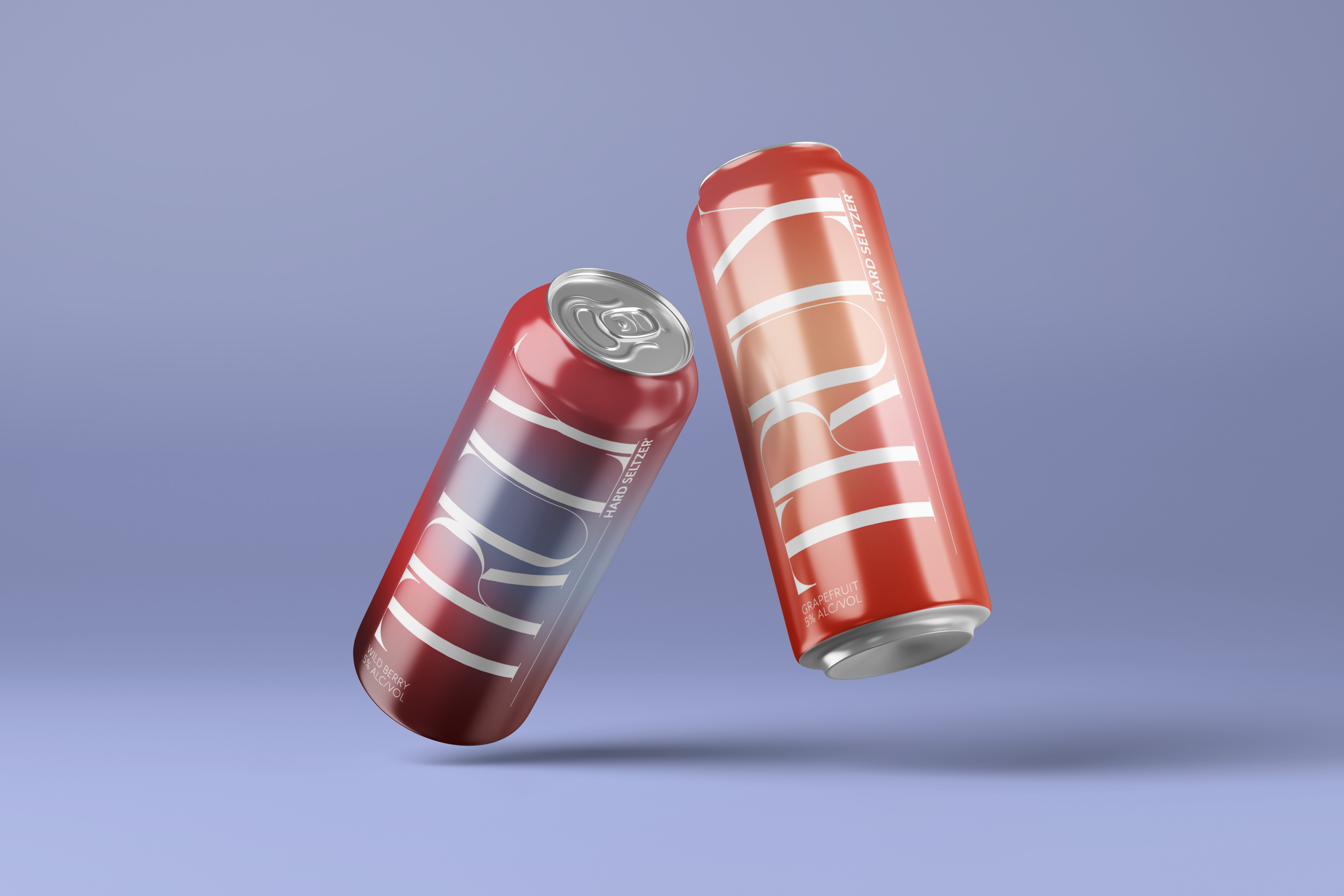
For the logo, I wanted them to stand out with a unique font. I chose a varied line weight serif font. This adds interest from the rest of the competitors, while adding a level of sophistication to their product. I wanted to keep some elements of the past design, so I kept the stroke under most of the "Truly" name. This also helps lead the eye to the secondary text on the can, "Hard Seltzer". I kept this in a bold sans serif to make this font easier to recognize on the can, and more recognizable to the past branding.
I placed the logo sideways on the can to make it the focus of the piece. The flavor and alcohol content percentage are left-aligned below the logo. This makes them easy to locate, while still driving the focus to the logo. I wanted to make the can stand out, so I chose to have the background be bright gradients with colors that are reminiscent of the flavor of the seltzer that's in the can.
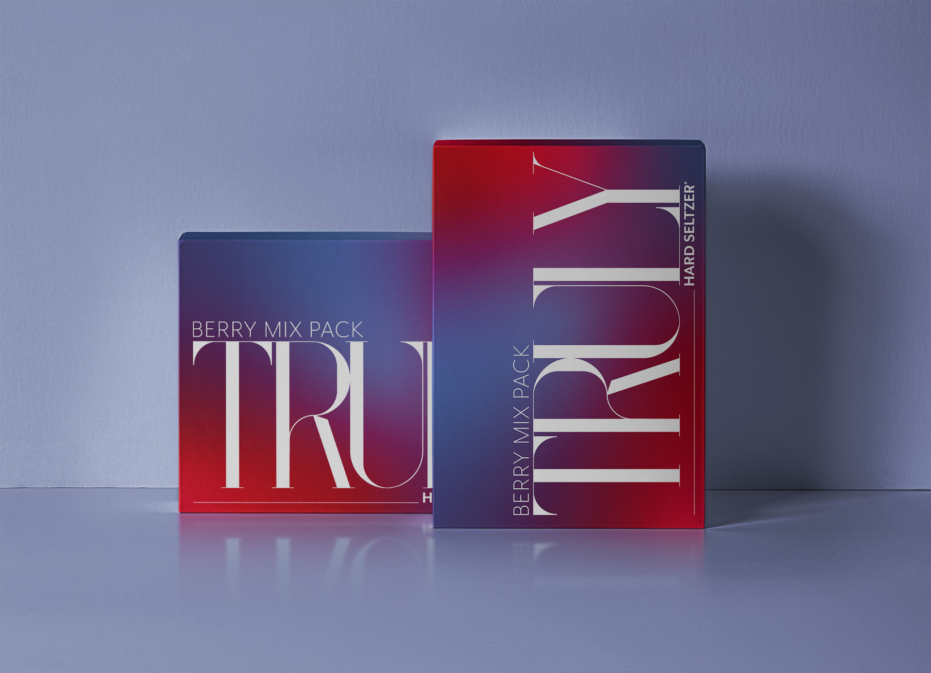
For the case, I wanted to maintain the same design as the cans. Because the brand stands out visually, the cases will be easily recognizable from every side, even without the logo visible. Just like the cans, the gradient on the background uses colors the match the flavors of the drinks inside. For this example, I used the Berry Mix Pack to showcase this.